🗺️ Read the risk map
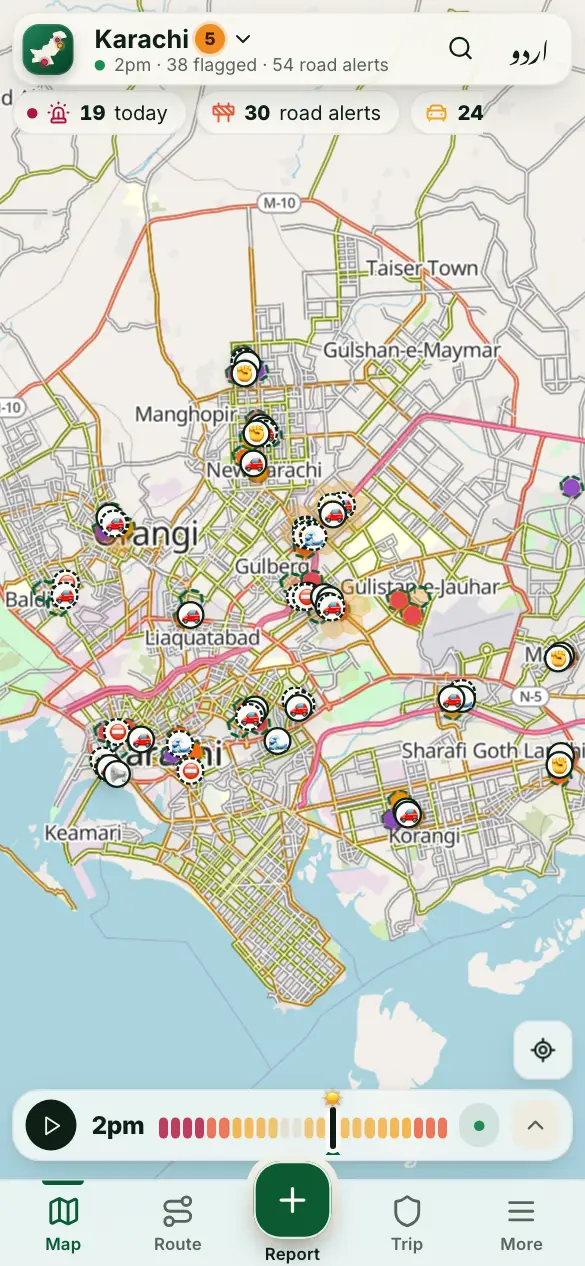
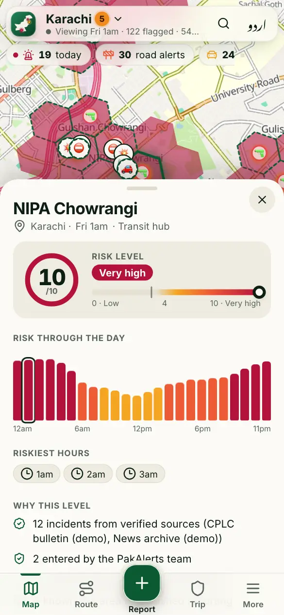
The map colours each area by its risk level (0–10, higher is riskier) for the hour you choose.
How to use it
- Open the map of your city. Red means very high risk, orange high, yellow elevated.
- An area with no colour has low risk or no data yet. It is not a promise.
- Move the time bar at the bottom to see another hour or day.
- Tap an area to see its risk through the day and “Why this level”.
Good to know
What is the risk level based on?
News from trusted outlets, police and CPLC, our team’s records, and community reports that another phone confirmed. The number next to the city name is the city’s level: its riskier areas over the whole day.
What are the dots?
Incidents: each dot opens what happened, where and when, and where it was reported.
What do 🚦 ✊ ⚠️ 🌊 mean?
Usual spots: a jam at this hour, a place where protests often gather, a place with many accidents, or a place that floods when it rains (in the monsoon). Tap one to see its source.
More guides
- 🔎 Find a place and check an area
- 🧭 My route: the best time to leave
- 📍 Share my trip
- 🆘 SOS, “Are you OK?” and the trip PIN
- 🔔 Watching someone’s trip: Alert me
- 📝 Report a crime or a road problem
- 🏫 Smog and fog closures
- 🚓 Find the nearest police station or hospital
- 📡 See what’s happening near you
- 📣 Notifications and summaries
- 🎬 Share a picture or a video
- 📲 Install the app and switch language
Figures come from verified sources, our team and community reports. No personal data is kept. How the risk level works